幼少期より行動美術会画家、野田勲氏より絵画を学ぶ。よりアブストラクトな表現方法を求め、武蔵野美術大学映像学科へ進学。VJ、インスタレーション、パフォーマンスと表現の領域を広げる。インスタレーション作品は「インフォメーションアートの想像力展」東京都写真美術館でも展示される。2011年春、原点に戻り、ドローイングによる制作を再始動後、KATHARINE HAMNETT LAB DESIGN AWARDを受賞、YOUNG ART TAIPEI にて新人賞を受賞。 Carrousel du Louvreでの展示をはじめ海外を中心に活動中。
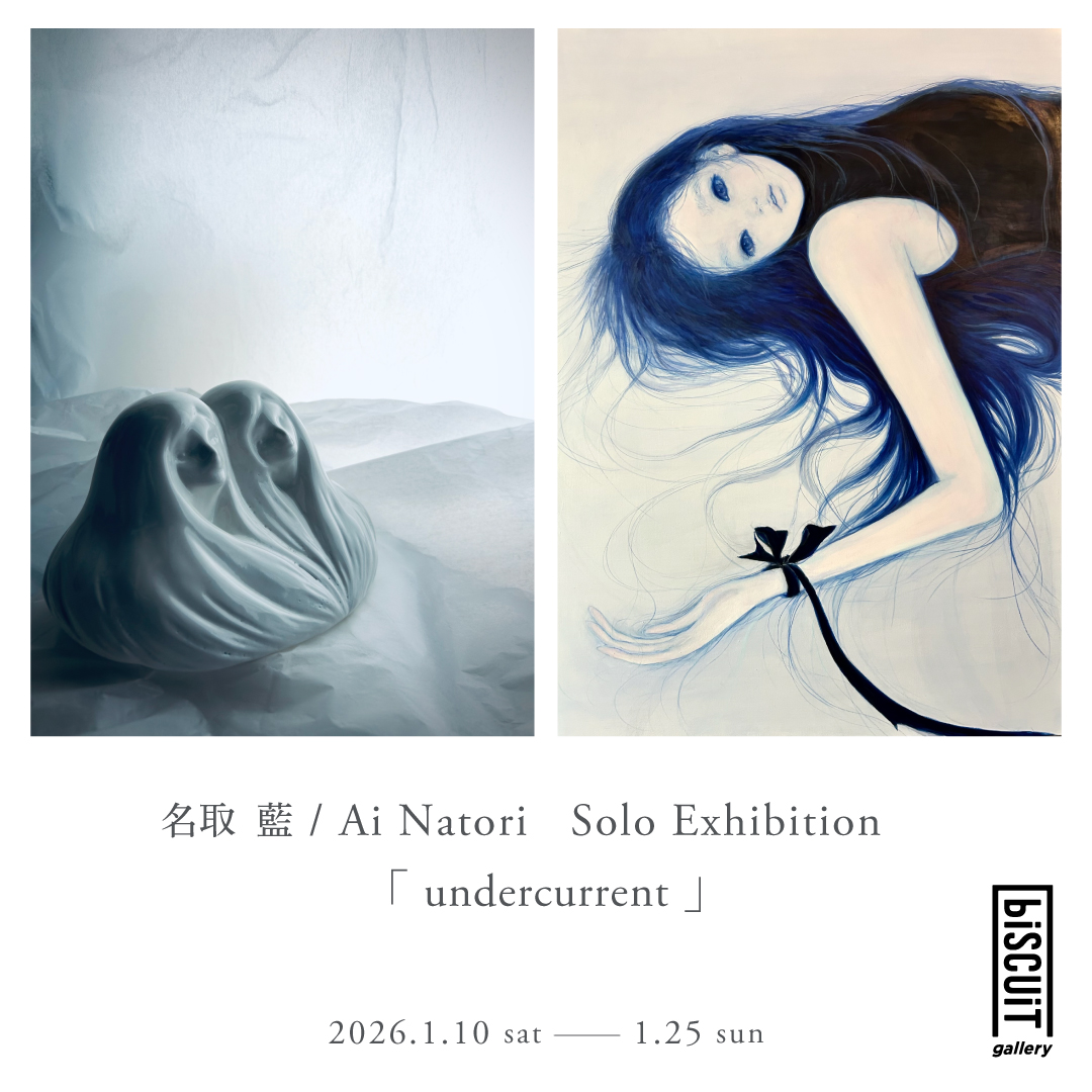
biscuit gallery (Shinjuku Ward) is pleased to present a solo exhibition “undercurrent” by contemporary artist Ai Natori.
The exhibition runs from January 10 (Saturday) to January 25 (Sunday), 2026.
An opening party will be held on the first day, January 10 (Saturday) from 16:00-19:00. The artist will be in attendance.
This is Ai Natori’s second solo exhibition at biscuit gallery, following her previous exhibition in Karuizawa. In addition to the painting works she has been developing, this exhibition will also feature ceramic sculptures, a new medium for the artist.
Additionally, Ai Natori has a group exhibition in Belgium scheduled for December 2025 and a solo exhibition in France in 2026, and she is an artist whose future activities are highly anticipated.
“undercurrent”
The word “undercurrent” carries both a literal meaning of an undercurrent flowing quietly beneath the surface of water, and a metaphorical meaning of emotions and thoughts hidden deep in the heart that are not visible on the surface, dark resonances, and faint presences.
An “inner flow” that is sometimes suppressed, sometimes quietly wavering.
I have been strongly drawn to this invisible movement.
Since beginning to paint the “Blueness” series, which uses more subdued colors than the “Blue” series, I have met many people through my works and connections have been formed. That communication has greatly expanded the very power of painting itself.
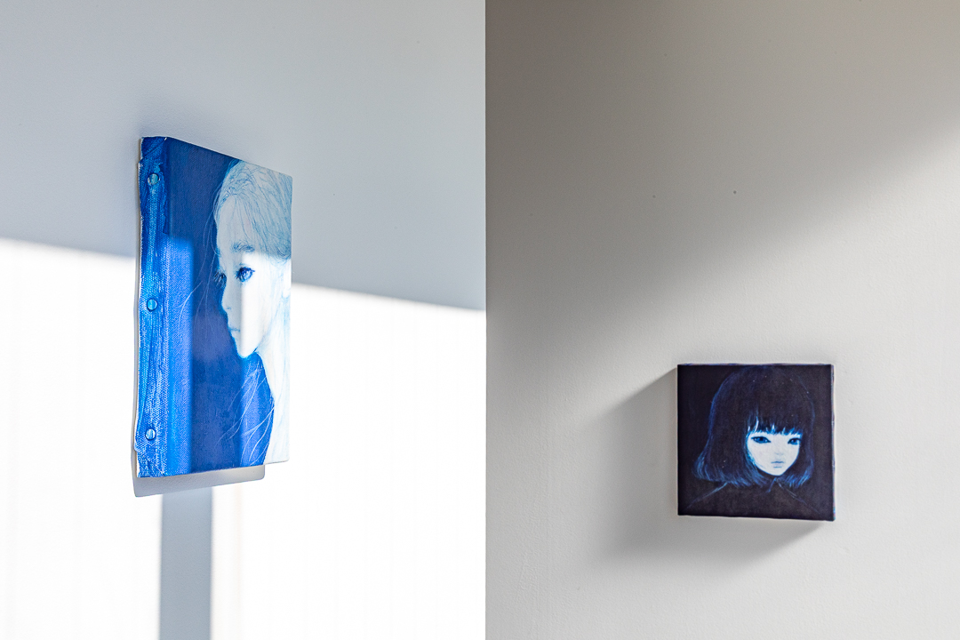
In the past, I painted semi-fictional figures modeled after my younger sister, but the faces depicted now continue to transform into composite beings that reflect those who view my work and my own inner self.
The “wavering” and “momentary strength” of the blue color embedded in my paintings are reaching people in various regions through social media and being received by them. Even now, that feels like a small miracle to me.
That blue emotion rose within me as the figure of a traveler drifting through the silence of night, searching for light in the darkness, and led to a new series called “Night and wonderer”.
With each painting completed, I touch more intimately and more deeply the undercurrent within myself—that time quietly changed my work and myself.
I hope that this solo exhibition “undercurrent” will be a place where those who see my paintings and three-dimensional works and my feelings embedded in the color blue flow back and forth like the currents beneath the water’s surface.
Through the work, the quiet flow hidden deep in your heart and my undercurrent touch gently.
I would be delighted if I could offer you such a time and space.
Ai Natori
While Natori boasts high popularity among overseas audiences, it is somewhat intriguing that many fans do not know that the blue color that fills her work derives from “indigo” (藍), the character in her name. In Japan, indigo blue is also called “Japan Blue” and has long been regarded as a color symbolizing unique cultural sensibility and aesthetic sense. Even if they do not know its origin, they must be naturally sensing Japanese sensibilities through Natori’s work.
Just as Tomio Miki persistently focused on ear imagery and Yayoi Kusama became obsessed with dots, Natori is captivated by and continues to paint indigo blue. This single-minded attitude reflects the very nature of her creative practice.
Natori speaks of blue (indigo) color as the “color of life and death*”. The blue of the sea, where life begins; the blue of the sky toward which life rises. The ephemeral expressions of the girls depicted in her work and the fragility lurking beneath them may well reside in the boundary that this blue color creates. It is often said that blue in art serves as a “color symbolizing the accumulation of time and memory,” and from this perspective, Natori’s choice to depict figures in blue could be seen as inevitable.
In this exhibition, she presents ceramic works as a new endeavor. Indigo blue is resistant to high temperatures and discoloration, and its color is unlikely to change even within the kiln’s flames. For this reason, it has long been regarded as a symbol of “immutability” and “permanence.” It is also noteworthy that indigo blue has been widely used in Arita ware, which originates from Natori’s hometown of Saga. By expanding her expression beyond painting to the medium of ceramics, Natori’s artistic world will resonate more richly with the symbolism of indigo blue and bring even greater conviction to her work.
Finally, I would like to touch upon Natori’s motif of “girls,” which has rarely been discussed.
Natori encountered art at age 10 when she began studying painting under Isao Noda, who taught at a local studio. She was deeply moved by Kiyotake Kuroda’s “Nobe” (野辺), which she happened to see at the former Ishibashi Museum of Art (Kurume), and the presence of the girl depicted on the canvas had a profound influence on her artistic expression. Additionally, as Natori’s body was not particularly strong from early childhood, her bond with her family ran deeper than most. Her younger sister, with whom she was especially close, was a special presence for her, and the first person she consciously depicted as a painter was also her sister. The feelings and influences she held during her childhood still live within her. Through the act of painting, they are sublimated and take form in her work as bright wishes and gratitude directed toward girls.
Following her solo exhibition at biscuit gallery karuizawa in 2024, Natori achieves further deepening in this exhibition. Please pay attention to the new narrative development guided by indigo blue.
Ai Natori
From Saga Prefecture
Graduated from the Department of Film, Faculty of Design at Musashino Art University.
From early childhood, she studied painting under Isao Noda, an artist of the Kodo Bijutsukai. Seeking more abstract methods of expression, she advanced to the Film Department of Musashino Art University. She expanded her artistic practice to include VJ, installation, and performance. Her installation work was also exhibited at the Tokyo Metropolitan Museum of Photography in the “Imagination of Information Art” exhibition. In spring 2011, returning to her roots, she restarted her creative work through drawing, winning the KATHARINE HAMNETT LAB DESIGN AWARD and the New Artist Award at YOUNG ART TAIPEI. She is currently active primarily overseas, including exhibitions at Carrousel du Louvre.
⚡ AI Translation
이번에 biscuit gallery(신주쿠구)에서는 현대미술작가 Ai Natori의 개인전 「undercurrent」를 개최합니다.
개최 기간은 2026년 1월 10일(토)부터 1월 25일(일)까지입니다.
초일인 1월 10일(토) 16:00-19:00에 오프닝 파티를 개최합니다. 작가도 재석합니다.
biscuit gallery에서는 가루이자와에서의 개최에 이어 두 번째 개인전입니다. 이번 전시에서는 지금까지 작업해온 회화 작품에 더해 작가 첫 세라믹 조각 전시도 진행합니다.
또한 Ai Natori는 2025년 12월 벨기에에서의 그룹 전시, 2026년 프랑스에서의 개인전을 앞두고 있으며, 앞으로의 활약이 기대되는 작가입니다.
「undercurrent」
“Undercurrent”라는 단어에는, 수면 아래를 조용히 흐르는 저류와 겉으로는 보이지 않는 마음속의 감정과 생각, 어두운 울림과 미약한 기척이라는 비유적 의미가 중첩되어 있습니다.
때로는 억눌려 있고, 때로는 조용히 흔들리는 「내면의 흐름」.
저는 그 보이지 않는 움직임에 강하게 끌려왔습니다.
“Blue” 시리즈에서 더욱 색을 절제한 “Blueness” 시리즈를 그리기 시작한 이후, 작품을 계기로 많은 사람들을 만나고 연결이 생겼습니다. 그 커뮤니케이션은 그림을 그리는 힘 자체를 크게 확대해주었습니다.
예전에는 여동생을 모델로 한 반쯤 허구의 인물상을 그렸지만, 지금 그려지는 얼굴은 작품을 봐주시는 분들, 그리고 저 자신의 내면을 비추는 복합적인 존재로 계속 변화하고 있습니다.
제 그림에 담은 파란색의 “흔들림”과 “순간의 강함”이 SNS를 통해 여러 지역의 사람들에게 전달되고 받아들여지고 있습니다. 이것은 지금도 작은 기적처럼 느껴집니다.
그 파란 생각은 밤의 고요함 속을 떠다니며, 어둠 속에서 빛을 찾아 계속 떠도는 나그네의 모습으로 제 안에 일어나 《Night and wonderer》라는 새로운 시리즈로 이어졌습니다.
한 장을 그릴 때마다, 더욱 친밀하게, 더욱 깊게 제 내면의 저류에 닿아가며 그 시간은 작품과 저 자신을 조용히 변화시켜왔습니다.
이번 개인전 “undercurrent”는 제 그림과 입체 작품을 봐주시는 분들과 파란색에 담은 생각이 수면 아래의 흐름처럼 오갈 수 있는 장소가 되기를 바라는 마음을 담고 있습니다.
작품을 통해 당신의 마음 깊숨에 잠든 조용한 흐름과 제 저류가 살며시 만날 수 있기를.
그러한 시간과 공간을 전해드릴 수 있으면 다행이겠습니다.
Ai Natori
해외 관객으로부터 높은 인기를 자랑하는 Natori이지만, 그녀의 작품에 가득한 파란색이 이름에서 유래한 「藍(남색)」임을 모르는 팬들도 많다는 사실은 어딘가 흥미롭습니다. 남색은 일본에서는 「재팬 블루」라고도 불리며, 특유의 문화와 미의식을 상징하는 색으로 여겨져 왔습니다. 설령 그 유래를 몰랐다 하더라도, 그들은 Natori의 작품을 통해 자연스럽게 일본적 감각을 느끼고 있는 것이겠지요.
Tomio Miki가 귀의 형상에 집요할 정도로 집착했고, Yayoi Kusama가 점에 집착했듯이, Natori는 남색에 매혹되어 계속 그려갑니다. 그 순일한 태도는 그녀의 제작 방식 자체를 비추어냅니다.
Natori는 파란색(남색)을 「생과 죽음의 색*」이라고 말합니다. 생명의 시작인 바다의 파랑, 생명이 올라가는 하늘의 파랑. 그녀가 그려내는 소녀들의 덧없는 표정과 그 깊숨에 잠든 위험함은 바로 그 파란색이 흔들리게 하는 경계에 깃들어 있을지도 모릅니다. 파란색은 흔히 미술에서 「시간과 기억의 축적을 상징하는 색」으로 다루어진다고 하는데, 그렇게 생각하면 Natori가 인물을 파란색으로 그리는 것은 필연적인 선택이었다고도 할 수 있습니다.
이번 전시에서는 새로운 시도로 도자 작품을 발표합니다. 남색은 고온에도 퇴색에도 강하며, 가마의 불 속에서도 색이 변질되기 어렵습니다. 따라서 예로부터 「불변성」과 「영구성」을 상징하는 색으로 여겨져 왔습니다. Natori의 출신지인 사가의 아리타 야키에 남색이 널리 사용되어온 것도 놓칠 수 없습니다. 회화를 뛰어넘어 도자라는 매체로 확장한 Natori의 표현은 남색이 지닌 상징성을 더욱 풍부하게 울려 퍼지게 하며, 그녀의 작품 세계에 한층 더한 설득력을 갖다줄 것입니다.
마지막으로, 의외로 언급되어온 적이 적었던 Natori의 모티프 「소녀」에 대해 언급하고 싶습니다.
Natori가 미술을 만난 것은 고향에서 교실을 열고 있던 Isao Noda의 아래에서 그림을 배우기 시작한 10세 때였습니다. 구 오하시 미술관(쿠루메)에서 우연히 본 Kiyotaka Kuroda의 《野辺》에 강하게 마음을 빼앗겼고, 그 화면에 등장하는 소녀의 존재가 그녀의 표현에 큰 영향을 미쳤다고 합니다. 또한 어릴 때부터 몸이 강하지 않았던 Natori는 가족과의 결속이 남다르게 깊었습니다. 특히 친했던 여동생은 그녀에게 특별한 존재였으며, 화가로서 처음 의식적으로 그린 인물도 여동생이었습니다. 어린 시절에 품었던 생각과 영향은 지금도 그녀의 내면에 살아 숨 쉬고 있습니다. 그것들은 그리는 행위를 통해 승화되어, 소녀를 향한 밝은 소망과 감사가 되어 작품 속에 형태를 이루는 것입니다.
2024년 biscuit gallery karuizawa에서의 개인전을 거쳐, Natori는 이번 전시에서 한층 더한 깊이를 이룹니다. 남색이 이끄는 새로운 이야기의 전개에 꼭 주목해주시기 바랍니다.
어릴 때부터 행동미술회 화가 Isao Noda 선생으로부터 회화를 배웁니다. 더욱 추상적인 표현 방법을 추구하여 무사시노 미술대학 영상학과로 진학합니다. VJ, 인스톨레이션, 퍼포먼스로 표현의 영역을 넓힙니다. 인스톨레이션 작품은 「인포메이션 아트의 상상력 전」 도쿄도 사진미술관에도 전시됩니다. 2011년 봄, 원점으로 돌아가 드로잉을 통한 제작을 재시작한 후 KATHARINE HAMNETT LAB DESIGN AWARD을 수상하고, YOUNG ART TAIPEI에서 신인상을 수상합니다. Carrousel du Louvre에서의 전시를 시작으로 해외를 중심으로 활동 중입니다.
从幼年开始在行动美术会画家野田勲先生的指导下学习绘画。为求更具抽象性的表现方法,进入武藏野美术大学影像学科。从VJ、装置艺术、表演等方面拓展表现领域。装置艺术作品也在东京都写真美术馆的”Information Art想象力展”上展出。2011年春,回归原点后重新开始素描创作,获得KATHARINE HAMNETT LAB DESIGN AWARD奖,在YOUNG ART TAIPEI获得新人奖。主要在海外活动,作品曾在Carrousel du Louvre等地展出。
 biscuit gallery